

30 Jan 3 behavioural insights that will improve your user interface
Are you better than a monkey at interacting with a digital user interface? (Spoiler: You’ll find the answer at the end of this article).
Previously, we’ve emphasised that a thorough analysis is a prerequisite to efficient behavioural design.
Now, we’ll give you some tips for the design part of behavioural design – focusing on how you can design a user interface that the ‘inner monkey’ (i.e., System 1) of your user will understand how to use without activating the ‘the suit’ (i.e., System 2).
This is how you design for the monkey
I’m sure you’ve heard one-liners like ”Make sure your product is intuitive”, ”reduce cognitive load” or ”make the user experience consistent”.
“Alrighty then, but how?!”
Let’s take a step further towards behavioural science and look at how (and why) you should make your product “intuitive”, “reduce cognitive load” or “make the user experience consistent”. The explanations draw on both cognitive– and perceptional psychology.
Make sure your product is intuitive
1. Exploit human spatial cognition
You’re often told that you’re supposed to design the user interface, so that it’s intuitive to interact with.
What intuitive really means, however, is hard to define accurately. When is something intuitive? When isn’t it?
One thing is certain: You can’t think that something is intuitive on behalf of users. Either it’s intuitive or it isn’t. Luckily, we’ve got evidence to support when it is and when it isn’t.
In /KL.7, we rarely talk of intuitive design. Rather, we talk about designing for the monkey rather than the suit.
In short, the monkey represents our automatic, unconscious behaviour whereas the suit represents the analytic and conscious behaviour.
In other words, we design for basic human abilities when we design for the monkey. If you design for basic abilities, you will make the user experience independent of for instance IT-skills, domain knowledge, or cultural differences from country to country.
Aesthetics is not the goal
“But we’ve already got a design guide?!”
And I’m sure you’ve spent a good amount of ressources creating it. But if you aim to design user interfaces that are aesthetic more than functional, you will risk creating a user interface that ‘the monkey’ doesn’t find intuitive.
When dealing with the design of user interfaces, we can design for basic abilities by exploiting human spatial cognition – the ability to see and understand the relation between two or more objects. The location and space between objects greatly influence how we understand and interact with them.
Let me show you what I mean, in this example from Spotify leveraging spatial cognition:

Below ’Top recommendations for you’ the objects are placed in a crooked position. But, completely without the use of buttons or text, it implies that more content is located on the right.
And here’s an example from the Danish streaming service, Filmstriben.dk:
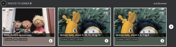
It is equally appropriate here, to leverage spatial cognition.
Instead, however, they’ve chosen to let the elements align perfectly in the middle and instead write “3 out of 25 movies” in the upper-right corner – in a font size that makes it barely noticeable.
In this example, your ‘inner monkey’ is challenged, partly because the infotext is barely visible, partly because it forces you to activate your ‘suit’.
If you want to design intuitive products, it is a good idea not only to consider color and shape, but also the space between and location of objects.
Are there places in your user interface where you value aesthetics more than functionality – and risk designing for the suit rather than the monkey?
Reduce cognitive overload
2. Limit the amount of options
Why are there so many different kinds of toilet paper in every supermarket? And what is toilet paper, what is kitchen roll? At least once I’ve come home with the wrong kind – an unfortunate case, no matter what.
The many options have two primary consequences for me as a user.
First of all, I’ll enter a state of choice paralysis. I simply can’t comprehend all the different kinds and prices.
Secondly, I risk getting what is called ‘buyer’s remorse’ – worrying that I could’ve made a better choice.
An easy choice is a good choice
All in all, it is hugely difficult, and painful, for me to make a choice. Which is unfortunate – ‘the monkey’ usually translates an easy choice to a good choice. And likewise, a difficult choice is translated into a bad one.
OK. So when we, as humans, become stressed in a situation like this we make wrong or bad decisions – which is why we will carefully reserve our mental ressources. In practice, this means that we’ll have difficulties acting or making a choice – for instance if the number of options or the amount of information exceeds our mental capacity. This phenomenon is called choice overload.
This is exactly what happens when you’re lying on the couch a Friday evening, searching for something to watch on Netflix. There are simply too many options.
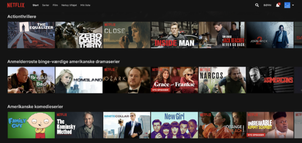
Particularly, the ‘buyer’s remorse’-effect is present here – what if you spend your hard-earned Friday evening on a shitty movie?
So, limiting the amount of options to the ones that are actually relevant is a good idea.
Consider the following when you are designing your user interface:
- Is it necessary to show the user all your services, products, or arguments at once?
- Can you remove or group excessive elements, that risk simply becoming “noise”?
- Can you limit the choice complexity of the options that are left?
Make the user experience consistent
3. Let the user recognize content
Did Dan Brown write the crime-series featuring Robert Langdon as the main character?
Yes, he did.
You probably knew the answer right away. But what if I had instead asked you: “Which American writer wrote the book series featuring Robert Langdon?”.
Would you have been able to answer?
Most likely.
Would you have answered as easily?
My guess is no.
The difference between recognition and recall
The two questions activate your memory in to distinct ways: The first question activates your ability to associate pieces of information and lets you recognise information (Dan Brown, crime-series, Robert Langdon).
The other question forces you to dig deep and recall information from your memory.
Your ability to remember things is primarily influenced by three factors:
1) How many times you have experienced, remembered, and applied the information
2) The last time you applied it, and
3) In what context it appears
Therefore: The frequency with which a piece of information is applied will determine the ease with which you can remember it.
You won’t suddenly forget how to unlock your bike or how you turn on the stove. But when it comes to things that are only rarely used, it is useful to employ the user interface in letting the user recognise content. User interfaces can do this by making the information visible when it is relevant.
Momondo.com (and a good deal of other, larger search engines) do this exceptionally well.
For instance, Momondo will remember the destinations you have previously searched for, when your departure is, and how many tickets you want.

It makes it a lot easier to initiate your search the next time you arrive at the webpage. ”When, where, and how many are you going?” becomes “Are you going from Copenhagen to London between the 21st and 23rd of February?”.
Yes, please. *Click*.
In case we seek to let the user recall information more easily we can accomplish this by following conventions.
“How about putting the search field in the footer?”
Good web-designers know that they shouldn’t experiment too much with icons and the placement of elements – it makes it harder to recall where they are located and what they mean.
In practice, this means that you should sometimes copy-cat your way through the design as much as you can.
No matter the product, you should always consider how others have chosen to design similar products and whether there are already conventions (widely used approaches) for the interaction. You won’t hear a webdesigner says: “How about placing the search field in the footer?”.
In other words, it is far easier for us to remember a piece of information by recognising it rather than recalling it.
Consider the following when you design your user interface:
- Are there places where we force the user to recall information or features – where we could have instead made them visible for recognition or remembered them for the user?
- Are there places where the function is hidden when the user needs it, so recognition isn’t an option?
- Are there places where you don’t following design-conventions – and have placed or illustrated elements in opposition to the user’s expectation?
Do you have a user interface that could use a behavioural examination? Call or email us here.
The monkey always wins
Lastly, you will, as promised, find out if you’re better than a monkey in interacting with a digital user interface.
In this particular case, you’re not.

Casper is a master student at the IT-University of Copenhagen, studying Digital Design and Communication. Previously, he has worked as a UX assistant in Coop's product development department. In /KL.7 he assists in projects with both research, concept development, design and communication.